Helicopter Parent UI
Monday, March 1st, 2021
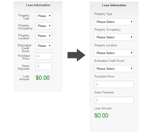
I’m coining the term Helicopter Parent UI ™ – Defined as Providing unnecessary assistance in User Interface Design.
Posted in Design | 1 Comment »
Motion UI For Foundation Mobile Menu
Monday, September 22nd, 2014
Lately, I’ve been seeing some chatter about Motion UI. Motion UI is the practice of using subtle animation to give affordance in a User Interface. With Flat Design in full effect, sometimes context can be absent from the UI. Motion helps the user to realize what just happened or where they just came from, thus providing a better User Experience.
What surprises me about Foundation 4 & 5 is that there’s no animation options for their mobile Top Bar menu. By tapping on the Top Bar hamburger menu icon, the menu list snaps open! This can be jarring to the user, so I decided to add a subtle transition easing effect while opening and closing the menu.
Out-of-the-box, Foundation sets a height of 45 pixels on the .top-bar element. You will need to change this property to max-height. I’ll explain later. After you do that, then add the transition CSS as seen below.
.top-bar {
  max-height: 45px;
  -webkit-transition: max-height .3s ease-in-out;
  -moz-transition: max-height .3s ease-in-out;
  -o-transition: max-height .3s ease-in-out;
  transition: max-height .3s ease-in-out;
}
Posted in Code, Design, Mobile | No Comments »
Media Queries For HTML Elements
Thursday, July 17th, 2014
Problem
Recently, I needed to reuse some markup for a component. The markup to be reused was to be put inside a modular, HTML component in a side panel of our application. Alternatively, it was the main content on another page. The problem is that the component needed to respond to the width of the side panel, which only took up 2 columns of an 8 column grid. So, basically I needed that media query to display the “mobile view” inside that 2 column panel. The CSS styles for the mobile view cannot be rendered unless the media queries conditions were met. I used the same markup for the side panel, but without the media queries firing off, the layout was not stacking the way I needed it to (figure 1). My first thought was to have 2 separate HTML snippets, but that’s not practicing modular design, so I started looking for a solution.

figure 1
Posted in Code, Design, Development, Mobile, Web Design | No Comments »
Creating Custom Icon Fonts
Wednesday, July 31st, 2013
Benefits of Icon Fonts
I’ve always been obsessed with icons and hieroglyphs, so as a web developer, I got all excited with the sudden popularity of icon fonts. Using icon fonts, as a replacement for images, has many benefits. The most important, in my opinion, is performance. Because icon fonts are vector and are contained in a single file, they perform better then, say, using a sprite as an image container. Although, both a sprite and a font file make a single HTTP request, the icon font file is usually a lot smaller.
Another important benefit of using icon fonts is optimization for high-resolution screens. The media query is a wonderful thing, but if it can be avoided for swapping images for high-resolution screens, it’s a quick win – one file for all screens and device types! Because icon fonts are vector, they will scale without loss of quality and again, when you compare file size and the single HTTP request, it’s a no-brainer.
With icon fonts, it’s also super easy to change color and size using CSS. As browser support for CSS3 becomes more advanced, you will be able to do all kinds of other cool stuff, like apply gradients, drop shadows and background textures.
Getting Started
There are a few icon font generators out there, but I’m using Icomoon because you can import your own vectors, import other icon font packs, only include the icons you need, use the Private Use Area feature, etc. The best part about Icomoon is that it’s 100% free and open!
The first thing you’ll want to do is go to http://icomoon.io/app/. When you first enter the app, you will see icons galore! If the icons that are needed are on the screen, you can simply click to highlight the icons you want. You must make sure that the Select tool is selected, but I’m pretty sure it is by default. There are two other tools available. The second tool is the Delete feature. When selected, it removes the icon from the icon library that displays on your screen. The third tool, is the Edit tool. When selected, simply click on an icon to edit. You will see a pop-up window (figure 1) with the icon you selected and a few features including Rotate, Flip, Scale and Move. You can also download that icon as an SVG. This is helpful if you want to take it into Illustrator and make changes to the icon that wouldn’t be able to made inside of Icomoon.
Tags: CSS, design, fonts, HTML, icons
Posted in Code, Design, Development, Mobile | No Comments »
Artifact Conference 2013
Monday, June 17th, 2013
Last month I was fortunate enough to attended the inaugural Artifact Conference in Austin, Texas. Artifact is “a two-day, single-track conference for DESIGNERS adapting to the challenge of designing for a MULTI-DEVICE world”. That description was exactly what I was looking for while preparing myself to dive into the world of Responsive Web Design.
It all started with Jennifer Robbins having an idea for a pow-wow to discuss a new workflow for a multi-device web, since our old processes and workflows are no longer cutting it. She tweeted about it and Christopher Schmitt from Environment for Humans obliged within two minutes. Thank you both!
@jenville I’m in!
— Christopher Schmitt (@teleject) August 29, 2012
Tags: conference, Future Friendly, Responsive Web Design
Posted in Design, Development, Mobile, Travel | No Comments »
Mobile App Training By Apigee
Sunday, March 31st, 2013
Last Friday I attended a free mobile app training session with Apigee. We used jQuery Mobile combined with PhoneGap to produce a rich native mobile application. The training session was led up by Tim Anglade, Head of Developer Programs & Evangelism at Apigee. Tim has an impressive resume and is completely comfortable speaking in front of a crowd.
jQuery Mobile
The first half of the morning was spent introducing jQuery Mobile followed up by a crash-course in using the mobile web UI framework. Tim also introduced a drag-and-drop WYSIWYG called Codiqa to keep things moving for those unfamiliar with jQuery Mobile. Codiqa is great because you can use it as a prototyping tool and share designs with clients and/or collaborators. Having used jQuery Mobile since it’s first alpha release, I chose to open up TextMate and go to town.
Tags: BaaS, HTML5, Mobile
Posted in Code, Design, Development, jQuery, Mobile | No Comments »
Future of Web Design NYC 2012
Wednesday, November 28th, 2012
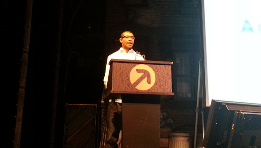
Last month I attended Future of Web Design NYC. The conference topics included everything from The Future of UX and The Future of CSS3 Layout to Typography Best Practices and Culture as a Factor in Digital Design. Some of the speakers were well known, such as Karen McGrane and Chris Coyier, while others were what they were calling “Rising Stars”. Each Rising Star Session that I attended was more than what I would expect from a so-called amateur speaker.

Rising Star – Senongo Akpem
One of the highlights of the conference was visiting with Denise Jacobs. This woman is amazing and has great stories to tell. We ended up talking for about an hour and a half, but it felt like 30 minutes. I saw her speak in San Francisco in 2009 and have been following her ever since, so it was a real treat to visit with her one-on-one.
Posted in Code, Design, Development, Travel | No Comments »
Prototyping With HTML5 localStorage
Tuesday, October 30th, 2012
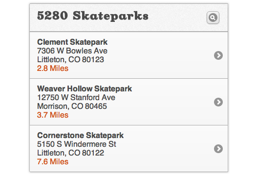
Prototypes are good for helping clients understand functionality in their application. Prototypes are also really good for usability testing the flows and functionality. Often when conducting usability tests, we tell the test subject that it’s a prototype and to pay no attention to the details as they may not be accurate. A good example of this is a details page. Let’s say you have a list of locations in a location finder application (figure 1). In the prototype you only have one static details page with only one of the locations. Wouldn’t it be nice if the details page information matched the item the test subject selects from the list? localStorage can help you with that!

figure 1
Posted in Code, Design, Development, jQuery, Mobile | No Comments »
HTML5 Denver Users Group – Stop Using Native HTML5
Tuesday, August 21st, 2012
The following is a short introduction provided by Kyle Simpson (@getify):
“No, don’t stop using HTML5, just stop using the native HTML5 JavaScript API’s directly. They’re still in flux, there’s still bugs that need to be shim’d, etc. Your code needs to use these features, but it needs to be more robust.
What you need is to use in your apps is a thin facade (wrapper API) around those features, so that as things change, bugs come and go, etc, all that needs to change is the internals of your facade, and not your actual app code.
H5API is a project to build these thin facade APIs for the various HTML5 native APIs. We’ll examine why we need something like this, and how H5API will help us build more robust HTML5 apps.”
Posted in Code, Design, Development | No Comments »
HTML5 Denver Users Group – The Making of a Sidescroller
Thursday, August 9th, 2012

HTML5 Denver Users Group co-founder David Geary demonstrated how to build a full-featured video game that runs smoothly on desktop and tablet browsers. His sidescroller video game consisted of scrolling background, parallax, sprites, collision detection and explosions! Here are my notes from his presentation.
Considerations
- CSS3 is implemented with hardware acceleration making it fast
- When we don’t use hardware acceleration we’re hitting the CPU
- Can’t do full featured video games without hardware acceleration
- Auto-pause (When focus on a different window)
- Slow fps detection
- CSS3 transitions between lives
Posted in Design, Development | No Comments »
