Web Form Design – Label Lengths
When it comes to web form labels, how long is too long? As a general rule, a designers goal for web forms is to increase intuitiveness, streamline the completion process, increase conversion and optimize for mobile devices. With that being said, I recommend using short, succinct and descriptive labels; one to two words. Not only is this best practice for visual scan-ability, but it also decreases the time it takes a user to complete the form process, which will increases conversion.
Some may use form labels that are first person narrative or Mad Lib style in an effort to try to make web forms “fun” or more “user friendly”. I call this Helicopter Parent UI. Here are some of my concerns with long form labels.
Accessibility
Accessibility is a big concern when considering form labels. People that use screen readers already have a time consuming and daunting task just getting through the form. Increasing the time it takes a screen reader to communicate each label/field combo decreases the chances of conversion from these users.
Localization
Typically, Spanish sentences are 25% longer than English sentences. Long form labels would increase the time it takes for Spanish speaking users to complete the form while increasing the drop-out rate, which falls out of line with the common goal of increasing your conversion rate.
Mobile
Mobile layout must be taken into consideration when designing forms for mobile devices. Typically, in a mobile view the form labels are stacked on top of the text field because of the lack of space to accommodate a 2 column layout. Because of this, longer labels can wrap to multiple lines giving the form a more lengthy appearance (figure 1). Studies show that users inspect web pages by scrolling to the bottom before interacting with it’s elements. By increasing the length of the labels, users could be discouraged by the length of the form and abandon it all together.

figure 1
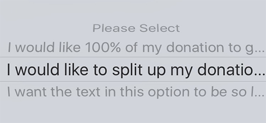
The limited width on iPhones, which account for 67% of all mobile web traffic in the U.S. and Canada, only allows so many characters in select menus before giving it the ellipsis treatment (figure 2), resulting in a bad user experience.

figure 2
Conclusion
While the first person narrative and Mad Lib patterns can add life to short forms, it can have the opposite effect when forms are too long. Web forms can stand between the user’s goals and business goals. That’s why it’s important to respect the user’s time by streamlining the form completion process. We should be aiming to reduce the time it takes users to complete web forms, not increasing it.
